Best Practices for Impactful Retail Signage
Multiple studies have proven that retail signage is highly effective at influencing and driving sales and that shoppers remember signage as part of the shopping experience. Whether for Branding, Information, Navigation or Promotion purposes, signage plays a vital role in the retail environment. In this article, we share best practices for displaying these different types of signage and offer four tips for designing your signage for the greatest impact.
Outdoor Signage
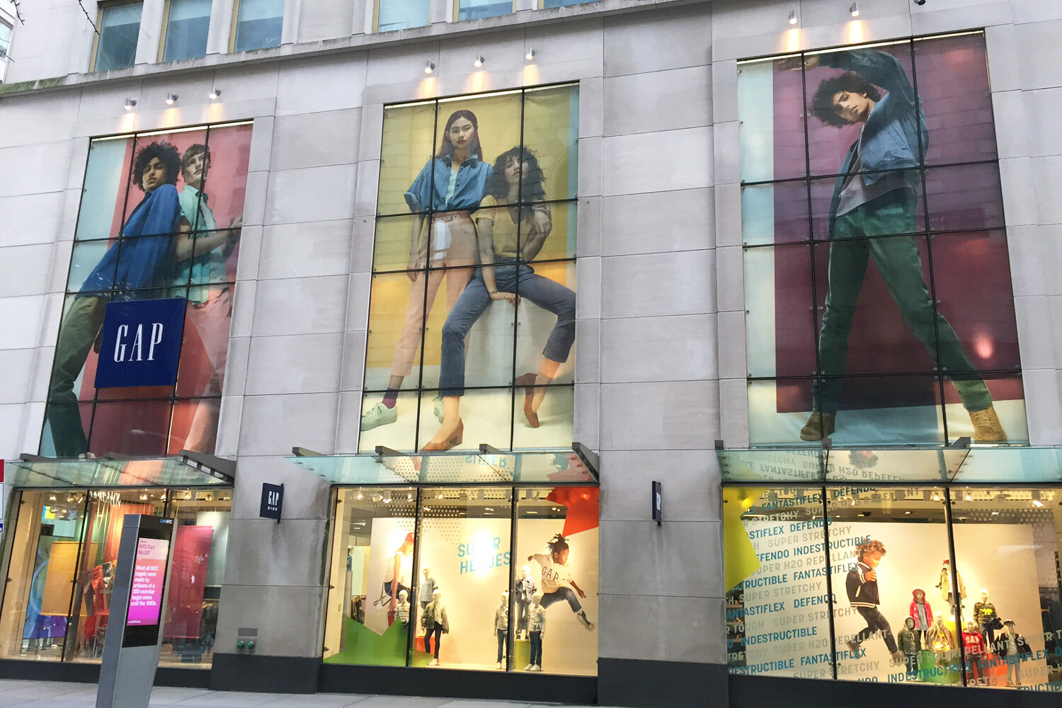
Outdoor signage is critical to brick-and-mortar retailers because it’s what gets shoppers in the door. Many marketers may argue this is the toughest hurdle. Exterior signage is the first impression customers have of your business, who you are, and what they can expect when they do enter your store.
In today’s current environment, it is important that shoppers are reassured that your store is clean and safe to enter.
Outdoor signage may include a pylon, sidewalk or yard sign, parking signs, entrance signs, banners, and window graphics. Place signage in highly visible areas to attract both walk-by and drive-by traffic. Eye-catching signage may get the attention of people who have passed your store many times. Give them a reason to step inside.
Directional Signage
Once shoppers enter the store, your directional signage is critical to giving guests a pleasant shopping experience as they help the customer navigate your space more easily. The easier it is for a customer to find what they came in for, the more likely they are to return.
Directional signage is also known as departmental, informational, or wayfinding signage. Directional signage tells customers where to go as well as add to the look and feel of the design of the store. Department signs should have a similar appearance and be placed at a similar eye level so that shoppers begin to recognize and look for these signs to help them navigate the store. Retailers can strategically place the signage to subconsciously influence flow and guide shoppers through to different areas of the store they want them to shop. This is especially important in a large big box or grocery store.
Branded Signage & Graphics
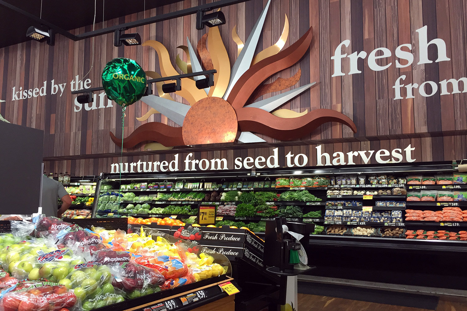
Use signage to tell your brand’s story and reinforce the shopper’s overall experience with your brand. It’s important for retailers to be transparent and to focus their marketing efforts on the local community and demographics with their choices of lifestyle images and graphics.
Branded signage should be located in a variety of store locations for reinforcement. Timeline graphics and photos that communicate the history and mission of the company help customers identify with the brand. Messaging may include specific values or taglines. Also, a simple “Welcome” and “Thank You for Shopping” are a nice touch.
Promotional POP Signage
In-store promotional POP (point-of-purchase) signage is used to advertise a featured promotion, product or service throughout the store. POP signage and displays are proven to persuade shoppers and drive sales at the store level. In fact, one in six purchases are made when a POP display is present in the store and 16% of unplanned purchases are driven by a display the shopper saw while shopping.
POP signage and displays are meant to influence purchase behavior through persuasive messaging and compelling graphics. This signage is typically temporary and can be used in several places such as the store entrance, in the aisles, shelves, customer service areas, and store windows. POP has many forms: aisle violators, shelf talkers, channel strips, floor graphics, ceiling danglers, endcaps, posters, counter signs, window graphics and banners… the list goes on and on. Keep in mind this signage should be easy for someone at the store level to set up and display as well as to change out as needed.
4 Tips to Help Design Impactful Signage
Be specific: Get to the point. Include specific details about a service, product, or promotion (known as narrowcasting).
Be clear and concise: Customers should be able to read your sign in less than 5 seconds, or else it is ignored. Informational and outdoor signs, in particular, should have highly-visible, contrasting color schemes and include large, bold, easy to read fonts - nothing too fancy. A good rule of thumb: 1” high text = 10ft away visibility (most folks can actually see this up to 30ft, but 10ft is ideal)
Write in headline text: Effective signage uses a message hierarchy: headline, explanatory text, and a call to action. Keep it simple and omit any unnecessary words.
Include a call to action: Signs are advertisements with a simple goal of getting the customer to do or feel something. Tell them what you want them to do.
Orora Visual supports the retail industry with every aspect of your visual communication needs at the store level. Your design our ours, we work closely with our retail brand partners to fully understand and execute their marketing goals. Learn more about our full scope of services.


